What Is a Sankey Cash Flow Diagram? How to Read One
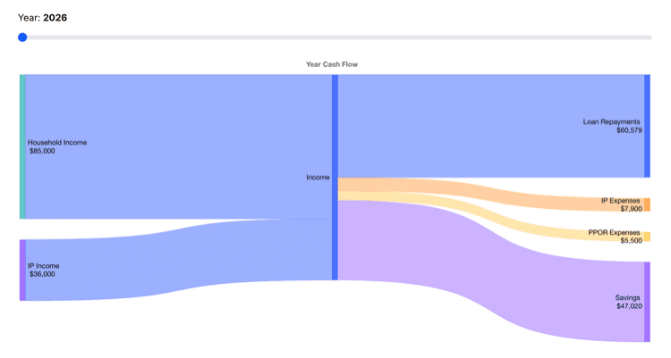
Table of Contents
- Quick answer
- Introduction
- Sankey Diagrams and Net Worth Over Time
- How a Sankey Cash Flow Diagram Works
- Why a Sankey Diagram Is Useful for Cash Flow
- Sankey Diagrams vs. Traditional Budget Tools
- What a Sankey Diagram Reveals That Numbers Alone Might Not
- Building a Sankey Cash Flow Diagram From Your Own Numbers
- How a Sankey Diagram Connects to Broader Cash Flow Tracking
- Frequently Asked Questions
Quick answer
A Sankey cash flow diagram is a flow chart where the width of each band is proportional to the amount of money moving through it, used to visualize how income splits into taxes, spending, and savings. As one detailed explainer puts it, "wide equals more money, narrow equals less money," which makes it easy to spot where money is actually concentrated at a glance, without reading a single number. It's essentially a visual version of a cash flow statement, income as the source, spending and savings as the branches it flows into.
Introduction
That same underlying data can be shown either way, as precise rows and columns, or as a proportional flow, each suited to a different kind of question about the same finances.
Spreadsheets are precise, but they're not always easy to actually understand at a glance. A column of numbers can tell you exactly how much went to housing, groceries, and savings last month, but it takes real effort to mentally translate those numbers into a sense of proportion, is housing eating up half your income, or a fifth?
A Sankey cash flow diagram solves that specific problem. Instead of numbers in a table, it shows income and expenses as proportionally sized flows, visually branching from a single source into however many categories a budget is broken into, making the overall shape of a person's finances visible in a single image.
This guide covers how to read a Sankey cash flow diagram, what makes it useful compared to a traditional budget spreadsheet, and how it connects to a broader personal cash flow picture.
Sankey Diagrams and Net Worth Over Time
A Sankey cash flow diagram typically captures a single period, a month or a year, rather than showing change over time the way a net worth trend line does. The two are complementary: the Sankey diagram explains why net worth moved the way it did in a given period, by showing exactly where the money went, while the net worth trend shows whether that pattern, repeated period after period, is actually building assets over the longer run.
How a Sankey Cash Flow Diagram Works
A Sankey diagram starts with a single source, typically total income, represented as a band whose width corresponds to the total amount. From there, the diagram splits that band into smaller bands, one for each category income flows into: taxes, housing, groceries, savings, discretionary spending, and so on.
Each band's width is drawn proportionally to the dollar amount it represents, so a category consuming a large share of income appears as a wide band, while a small, minor expense appears as a thin one. The visual result looks like a river splitting into smaller tributaries, which is where the format gets its intuitive appeal.
Why a Sankey Diagram Is Useful for Cash Flow
It shows proportion instantly. A number like "$1,800 on housing" doesn't automatically convey whether that's a reasonable share of income or an alarming one. A wide band taking up half the diagram makes that immediately obvious without needing to do any mental math.
It surfaces categories that get overlooked. Small, recurring costs, subscriptions, minor fees, incidental spending, can be easy to underestimate individually in a spreadsheet, but they show up clearly once visualized as their own band, even a modest one.
It reveals the overall shape of a budget at a glance. A diagram where a thick band flows into savings signals a healthy surplus. A diagram where nearly the entire width flows straight through to spending signals the opposite, both visible immediately, without needing to read through individual line items.
Sankey Diagrams vs. Traditional Budget Tools
| Tool | Strength | Limitation |
|---|---|---|
| Spreadsheet or table | Precise numbers, easy to filter, sort, and calculate with | Harder to grasp overall proportion at a glance |
| Sankey cash flow diagram | Immediately shows proportion and where money concentrates | Less precise for exact figures, generally paired with underlying numbers |
The two aren't really competing tools, a Sankey diagram is typically generated from the same underlying numbers a spreadsheet or budgeting app already tracks, it's a different way of presenting the same data, optimized for pattern recognition rather than precision.
What a Sankey Diagram Reveals That Numbers Alone Might Not
Beyond simply showing where money goes, a Sankey cash flow diagram tends to surface patterns that are harder to notice in a plain table: how much of income is consumed by fixed, non-discretionary costs before any discretionary spending even begins, whether the savings band is meaningfully wide or barely visible, and which single category, often housing or taxes, actually dominates the overall flow.
Seeing that structure visually, rather than reasoning through a list of numbers, is part of why the format tends to prompt behavioral change more effectively for some people than a spreadsheet alone, the proportions are simply harder to ignore once they're drawn to scale.
Building a Sankey Cash Flow Diagram From Your Own Numbers
A Sankey diagram is only as useful as the data behind it. Building one typically starts with the same information needed for any cash flow tracking: total income for the period, and a breakdown of where it actually went, broken into whatever categories are meaningful, housing, food, transportation, savings, debt payments, and so on.
Once those categories and amounts are established, generating the diagram itself is typically handled by dedicated software or an app, rather than built manually. The more valuable part of the process is usually the underlying tracking that feeds it, an accurate, complete picture of income and expenses, without which even a well-designed diagram ends up visualizing incomplete or misleading data.
How a Sankey Diagram Connects to Broader Cash Flow Tracking
A Sankey cash flow diagram is ultimately just a visual representation of the same cash flow formula, income minus expenses, broken down by category instead of collapsed into a single number. Its usefulness depends entirely on the accuracy of the underlying income and expense tracking behind it, a beautifully rendered diagram built on incomplete or outdated numbers is still misleading, regardless of how intuitive it looks.
That's part of why a Sankey diagram tends to work best as a periodic snapshot, generated from consistently tracked income and expenses, like those used in a 50/30/20-style budget, rather than as a replacement for tracking the underlying numbers in the first place, complementing the tracking rather than substituting for it.
See your income and expenses visually with Calm Sea
Calm Sea tracks your income, expenses, and cash flow together, giving you a clear picture of exactly where your money goes
Frequently Asked Questions
What is a Sankey cash flow diagram used for?
Visualizing how income splits into spending, savings, and taxes, using flow bands whose width is proportional to the dollar amount, making the overall shape of a budget easy to see at a glance.
How do I read a Sankey cash flow diagram?
Wider bands represent larger dollar amounts, narrower bands represent smaller ones. Following the flow from the income source on one side to the various spending and savings categories on the other shows exactly where money is going and in what proportion.
Is a Sankey diagram better than a regular budget spreadsheet?
They serve different purposes. A spreadsheet offers precision for exact figures and calculations, while a Sankey diagram makes proportion and overall shape immediately visible. Many people use both together rather than choosing one over the other.
Do I need special software to make a Sankey cash flow diagram?
Various tools and apps can generate one automatically from tracked income and expense data, it's generally not something built manually from scratch for routine personal budgeting.
What data do I need before building a Sankey cash flow diagram?
Total income for the period, and a categorized breakdown of where it went, housing, food, transportation, savings, and so on. The diagram itself is only as accurate as this underlying tracked data.
Can a Sankey diagram replace my budget spreadsheet entirely?
Not typically. It's usually generated from the same data a spreadsheet or budgeting app already tracks, offering a different, more intuitive view of proportion rather than replacing the underlying record-keeping itself.
How often should I generate a new Sankey cash flow diagram?
Monthly is a common choice, matching a typical budgeting cycle, though some people generate one quarterly or annually instead to see broader patterns rather than month-to-month noise, either can work depending on what's actually useful to track.
Can a Sankey diagram show more than just one month at a time?
Typically each diagram represents a single period, though some tools allow comparing multiple periods side by side, which can help highlight how spending patterns actually shift from one month or year to the next over time.
Calm Sea is a personal finance planning tool. Nothing in this article constitutes financial advice. All projections and calculations are illustrative estimates. Always conduct your own due diligence and consult a qualified financial adviser before making financial decisions.